

Plascon colour forecast 2026: HAND,made – Make your own world

At the heart of painting is the hand. From choosing shades and testing swatches to bringing colour to life on a wall, the process is deeply tactile and human. Paint is not abstract or artificial; it is tangible, textured and deeply human. It is the hand that makes it real: authentic, unique and a mark of craft.
Plascon’s Colour Forecast 2026, themed HAND, made, celebrates that creativity and individuality. It is a collection that values imperfection. The colours do not just cover surfaces; they respond to daily life, and Plascon looked to the natural world and modern life for inspiration.
From horizons and waters to city streets and wild gardens, Plascon curated four distinct colour ‘worlds’ that express mood, movement, and meaning. Each world is both grounded and imaginative, pairing earthy tones with daring brights, and subtle neutrals with expressive accents.
From swatch to space – the process becomes a story told by the human hand and the transformative power of colour.
Butter + Sky
Airy, clean, and joyful
A world of lightness and optimism, Butter + Sky is inspired by expansive horizons and the comfort of yellow blooms and sunlit walls. Together, these shades capture both serenity and uplift, grounding while lifting gazes upward.
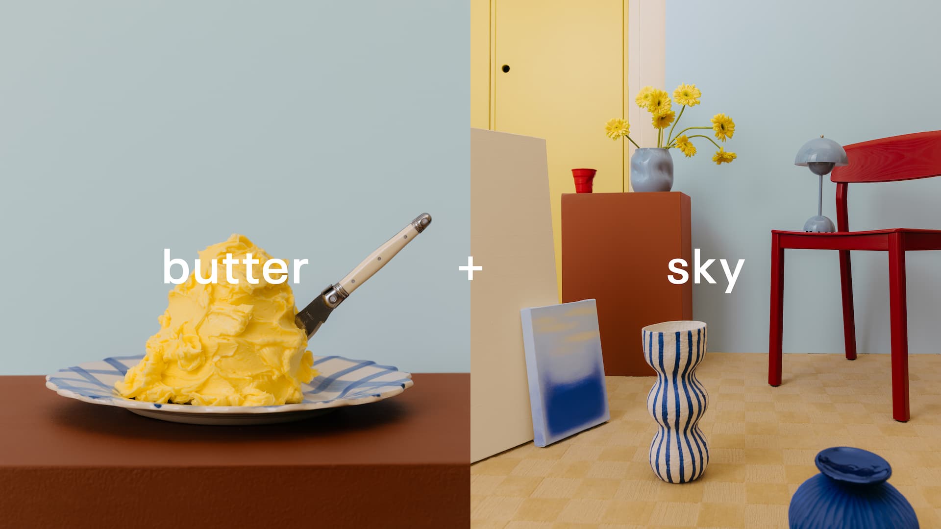
From Saphire (B7-A1-1) and Athena’s Dream (B4-A2-1) to Blazing Sun (Y4-A1-4) and Julia (Y3-A2-2), the colours capture the calm of daylight and the softness of air. Signal Red (G7), Chocolate Chunk (O2-D1-1) and Cave Painting (O2-C1-1) add depth and vibrancy, grounding the palette while keeping it joyful and uplifting.
Perfect for living rooms, studios, and bedrooms, this range pairs beautifully with light woods, soft textiles, and natural finishes, ideal for spaces that invite calm reflection and open energy.
Land + Sea
Cool, calming, and natural
Deeply rooted in the textures of earth and water, Land + Sea captures the tactile beauty of the outdoors. The palette draws from bark, moss, algae, lichen, and seaweed alongside muted blues and oranges. It is the palette of natural materials, weathered textures, and biophilic influences. The colours invite us to reconnect with the environment.

African Mud (O2-E1-1) and Olive (G2-E1-2) set a grounded base, while Frog Pond (Y6-D1-1) and Bashful Blue (B3-C1-4) add cool balance. Evening Stroll (G6-C2-1) and Day Lily Dream (O2-A1-1) bring quiet warmth, with Sparkling Lemon Lime (Y6-A1-1) adding a fresh, biophilic accent.
This palette speaks to the growing desire for sustainability and mindfulness in design. It complements organic materials like stone, linen, clay, and timber and is ideal for homeowners seeking to reconnect with nature indoors.
Fashion + candy
Vivid, daring, and pop-culture infused
Vibrant, eclectic, and unapologetically bold, Fashion + Candy channels the pulse of city life — street style, nightlife, and the thrill of escapism. These colours celebrate contrast and individuality, evoking neon-lit evenings, glossy red lips, and playful contrasts between architecture and fashion.

Ruby Tuesday (R5-B2-2) and Hot-N-Spicy (R6-B1-1) bring energy and glamour, while Bellagio Blue (B6-B2-1) and Eclaire (R7-D1-1) cool things down with sophistication. Lemon Essence (Y5-A1-2) and White Maas (Y2-A2-2) lift the palette with freshness, while Ginger Biscuit (O1-C1-1) adds a nostalgic warmth.
Perfect for feature walls, retail interiors, or youthful spaces, this palette taps into the resurgence of dopamine décor, colour as a form of joy and self-expression. It’s a visual playground for designers and retailers who want to inspire bold choices.
Orchard + Blooms
Organic, vibrant, and full of vitality
Inspired by fruit markets and garden centres, Orchard + Blooms celebrates abundance, texture, and growth. The palette combines peach and orange petals, olive-green foliage, and the richness of ripened produce, creating a lively yet harmonious feel. It is the most organic of the four worlds – tactile, multi-sensory, and rooted in cycles of growth and renewal.

Hudson (26) and Chocolate Delight (R6-E1-1) bring a sense of depth, while Spanish Brocade (O2-B1-3) and Wanda (Y4-C1-1) add a sun-kissed glow. Just Terracotta (R7-C1-1) and Swazi (R2-C1-1) deliver earthy warmth, complemented by Good Day Sunshine (O6-A1-1) for an energetic, uplifting finish.
The palette works beautifully in kitchens, garden rooms, and communal areas, spaces that celebrate togetherness and sensory richness. It’s tactile, multi-sensory, and rooted in renewal.
Empowering choice
To support this year’s trend toward creativity and confidence with colour, Plascon introduced the Plascon Perfect Colour Testers, an affordable, 250ml tintable sample pot available in an endless variety of shades in sheen, matt and water-based gloss finishes. Ideal for DIY consumers, interior decorators, and architects, it helps consumers test colours in their home, thus removing disappointment and increasing purchase conversion in-store.
Retailers can leverage this by displaying the Plascon Perfect Colour Tester samples alongside the Plascon Hand, made. Colour Forecast point of sale – encouraging trial, engagement, and add-on sales.
Celebrating the hand behind every brushstroke
With HAND, made., Plascon’s 2026 Colour Forecast celebrates people and the craft, care and creativity behind every brushstroke. From soft neutrals to statement brights, the four worlds invite everyone to explore, play, and make their own world of colour.
For more information, visit www.plascon.com or contact the Plascon Advisory Service 0860 20 40 60.


